newsletters
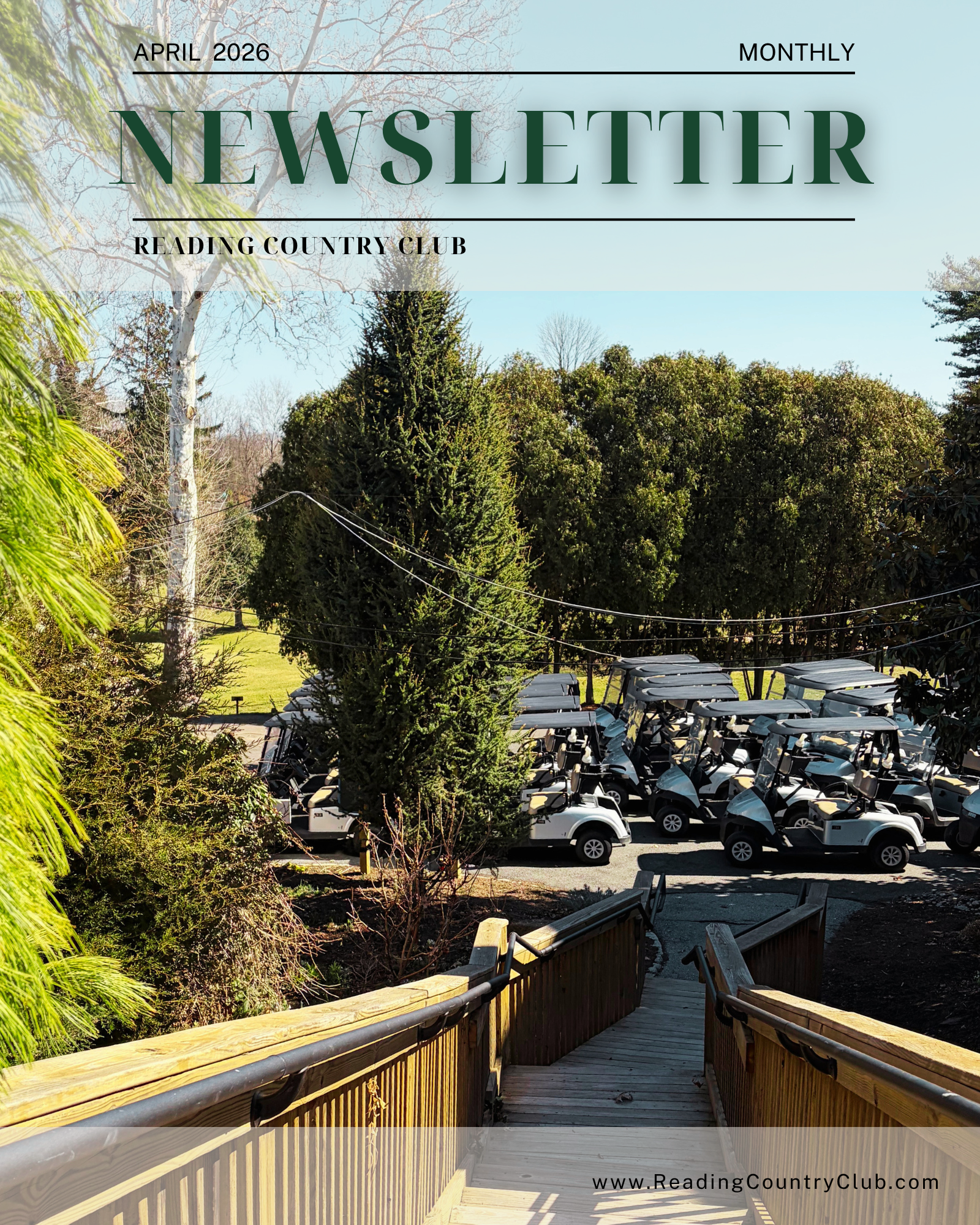
This April edition of the Reading Country Club newsletter showcases a strong focus on publication design, brand consistency, and promotional layout strategy. I developed a structured grid system and clear typographic hierarchy to organize event highlights alongside custom branded flyers for upcoming events, ensuring both readability and visual impact. The design balances dense informational content with engaging visuals through intentional spacing, color coordination, and layout variation. All photography was captured and edited by me, highlighting skills in composition, lighting, and color correction to maintain a cohesive visual identity. Written content from department directors was refined through careful editing to improve clarity, tone, and flow. This piece demonstrates strengths in editorial design, marketing integration, and creating polished, multi-purpose layouts optimized for both print and digital use.
April 2026
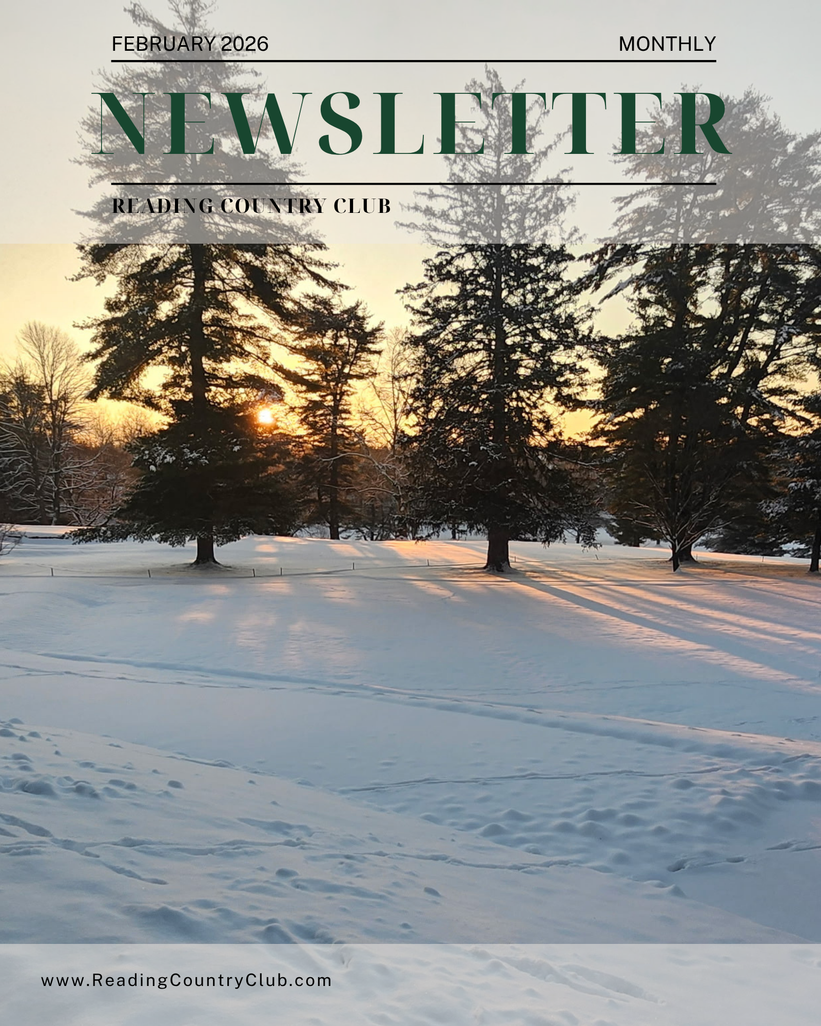
The February edition of the Reading Country Club newsletter emphasizes refined editorial layout, visual balance, and adaptive design techniques to accommodate a wide range of content. I utilized a flexible grid system and thoughtful typography to create a consistent reading experience while allowing individual sections, such as club updates, features, and promotions, to stand out. Strategic use of white space, alignment, and color helped establish a clean visual rhythm and improve navigation throughout the piece. All photography was taken and edited by me, reinforcing a unified visual style and demonstrating attention to detail in image selection and enhancement. Content provided by department heads was carefully edited for readability and cohesion within the layout. This project highlights skills in publication design, visual hierarchy, photo editing, and the ability to translate varied content into a cohesive, professional final product.
February 2026
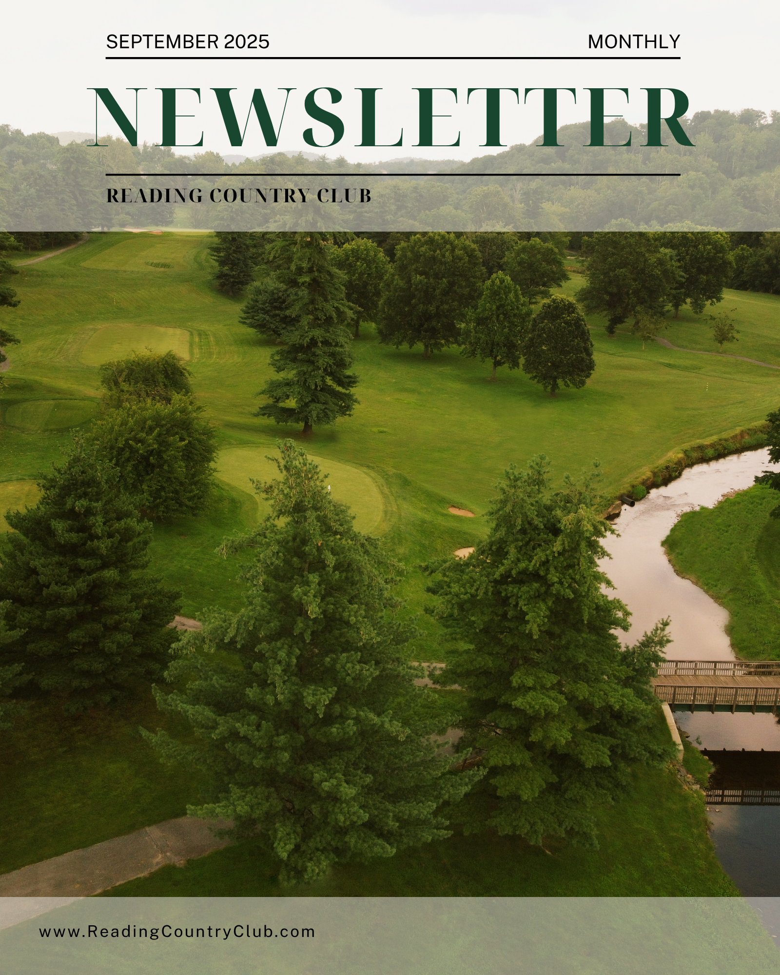
This September edition of the Reading Country Club newsletter was designed to capture the transition from peak golf season into a more event and holiday driven focus, requiring a thoughtful blend of editorial design and promotional marketing. I applied strong layout design and typographic hierarchy to organize a wide range of content, using grid systems to maintain clarity while allowing flexibility for seasonal features and branded event graphics. Strategic color usage and spacing were used to guide the reader’s eye and create visual rhythm across pages, while maintaining consistency with the club’s identity. All photos were captured and edited by me, demonstrating skills in composition, color correction, and visual storytelling to support the overall design. Written content provided by department heads was refined through careful editing to improve overall flow and guest comprehension. This project highlights strengths in publication design, brand consistency, photo editing, and the ability to translate diverse content into a cohesive, print-ready piece.
September 2025
Magazine Ads
Publication
Berks County Living
Published
October 2025
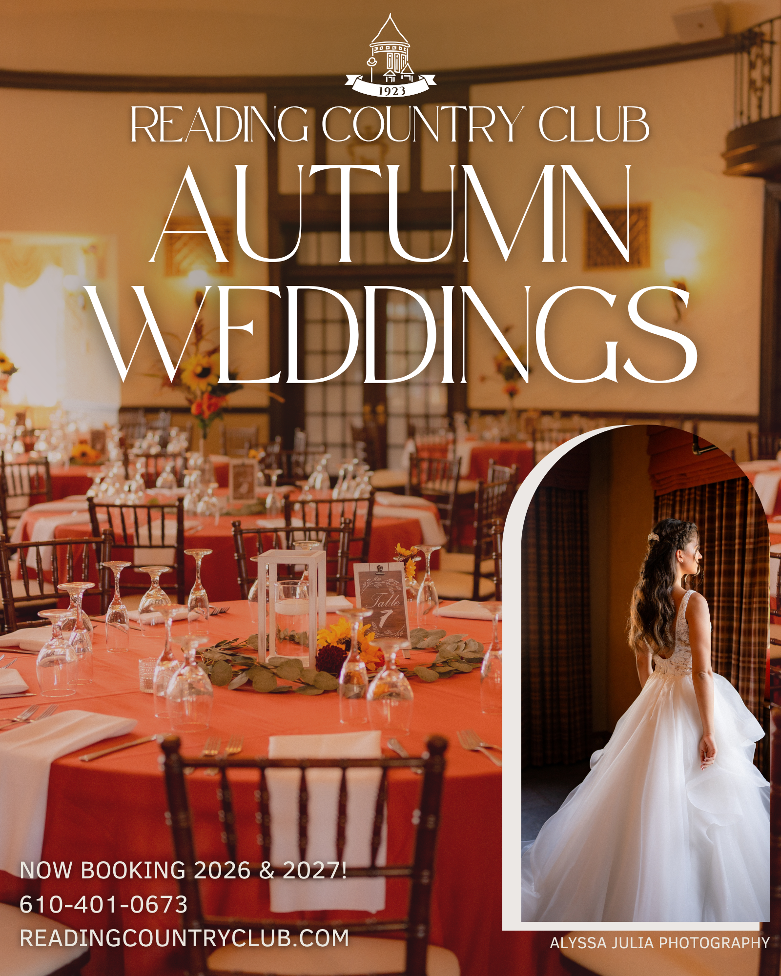
This full-page advertisement for Reading Country Club highlights the elegance of its autumn wedding offerings using imagery provided by wedding photographer Alyssa Julia. I enhanced the photos with subtle color correction to emphasize warm tones and create a cohesive, inviting feel, while using a softly blurred background to improve text readability. The layout balances a striking bridal inset with refined serif typography to reflect the club’s classic brand, and was designed with publication standards in mind to ensure clarity, visual hierarchy, and strong print quality.

Published
February 2026
Publication
Berks County Living
This full-page advertisement for Reading Country Club highlights the club’s signature cocktail experience through imagery I both captured and edited. I focused on rich color grading and lighting adjustments to enhance the warm, intimate atmosphere, while sharpening details to make the drinks the visual focal point. The composition was designed to feel dynamic and engaging, using bold serif typography and clear hierarchy to guide the viewer from headline to call-to-action, with placement optimized for print readability and overall visual balance.